
Role in Project:
Lead Interaction Designer, Assistant Graphic designer.
Contributors:
Contributors: Seth Van der Zweep, Victoria Lo, Gurnisha Rehal, Ryan Ng, Keannu Rubio.
Programs Used:
Figma (Graphic Design and User Interaction Design).
Timeline:
1 Week, completed in October of 2022.
Project Description
This project was created for an information design class at SFU. As a group of five we were tasked with re-imagining the web presence of an existing brand. This entailed the creation of a new website with additional features and product ideas from what currently exists.
Planning
The assignment specifications allowed our team to choose any business we wanted. We gravitated toward medium sized businesses as our candidates. We shied away from larger brands given the scope such brands would demand. As well, larger brands are near universally adequate in their web presence, leaving little to improve. Smaller businesses suffer from opposite problems. Researching them can be made difficult by scarcity of coverage, often there is little to no brand identity to re-imagine in the first place. Our group initially tried to make Laid Back Snacks, a snack food company, work, but found little success. Our group eventually settled on the Monte Creek Winery. We found that they had an adequately established brand, but still held room for improvement. Before beginning our design, we began researching ways in which the company fell short of customer expectations. This was achieved by both researching reviews and interviewing regular customers. Our group found that the brand lacked the capacity to regularly attract in-person customers to their tasting room and restaurant through their website. We devised that this could be remedied by advertising on-location events, and overhauling the brands approach to editorials.
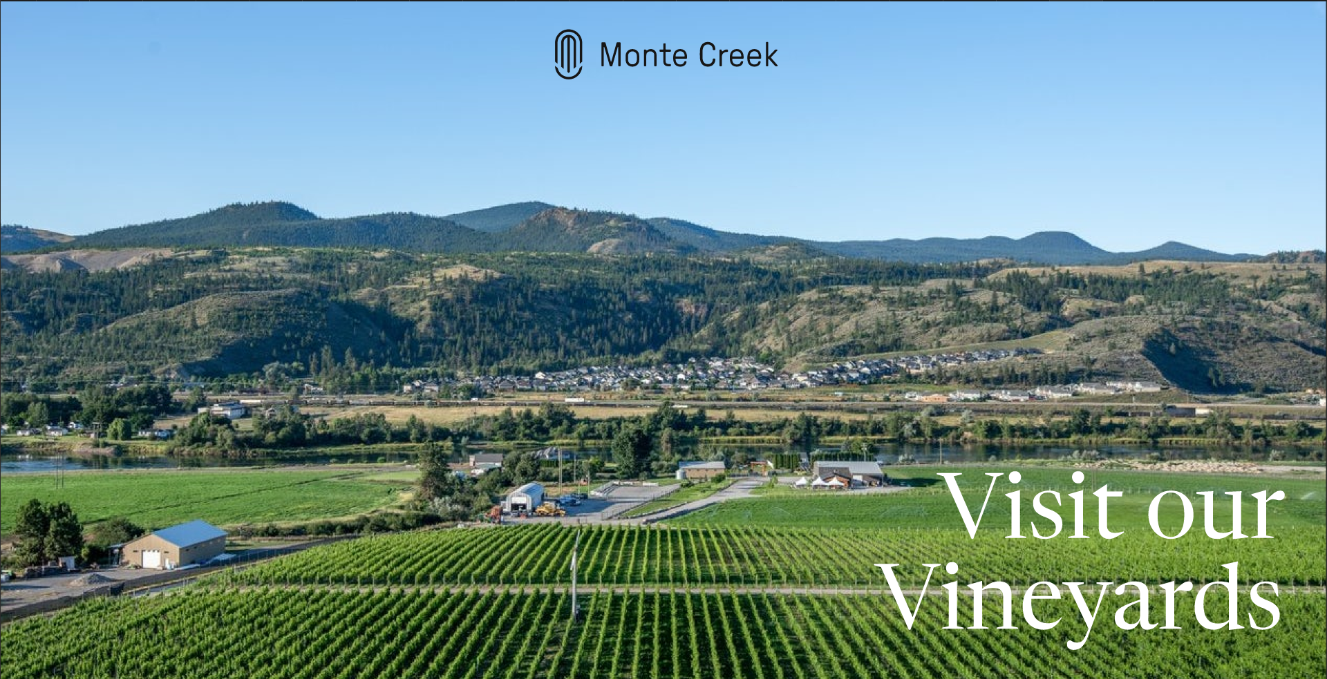
Figure 1: The image at the top of our ‘visit us’ page.
Wireframing
With our objective in mind, we began the wireframing process. It did not take us long to decide we wanted our navigation bar to take the form of a sidebar. It was also clear that we wanted to display beautiful images at the head of each page, to set the mood and immerse the viewer. We went through a great number of iterations deciding if our site should conform to a eight, twelve or fifteen column layout. Given that the different pages of the site served different purposes, they varied in design considerably. Even so, a consistent column count allowed for a sense of cross site cohesion.
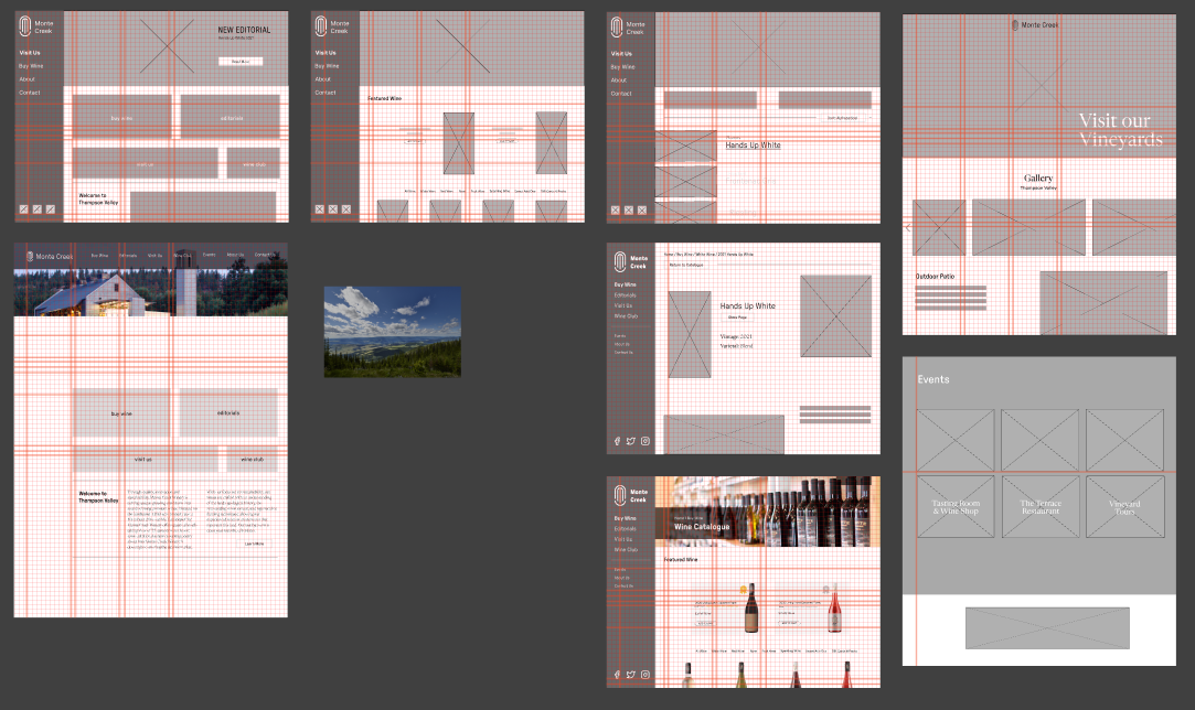
Figure 2: Some of our many wireframe prototypes.
High Fidelity Prototypes
Having put so much work into our wireframing, the biggest concerns with the conversion to high fidelity was choosing the right colour palette, typefaces and images. Although we flirted with the use of bright reds, we ultimately found them to be too distracting. Our final colour palette consisted of a leathery brown, whites and deep greys. As far as typefaces, we elected to use Pressure for header text and Newsreader for body copy. Newsreader’s serifs provide heightened readability. I had little to do with our group's image selection, but approved of those chosen nonetheless.
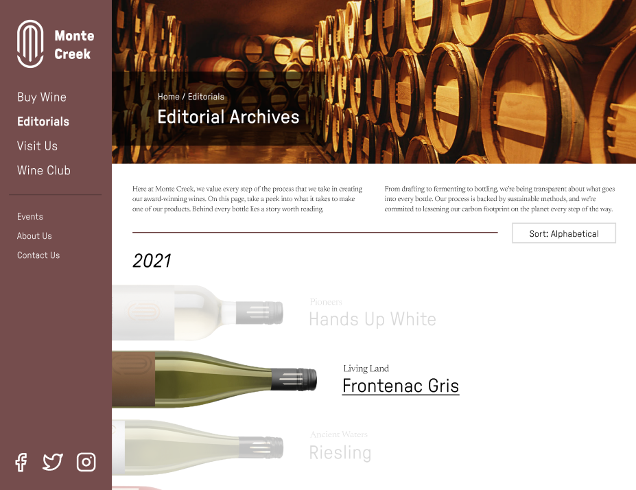
Figure 3: One of our many high fidelity designs.
Now came the time for these high fidelity designs to become an interactive prototype. I alone was given this task and researched to become proficient with Figma’s prototyping tools. I connected all the pages of the site and added visually interesting animations where possible. Showcasing this prototype to the teaching team greatly impressed them given we had improved our mark more than any other group that week. My prototyping skills would not go unnoticed by my peers, the next week I was asked to connect up another group’s high fidelity Figma designs.
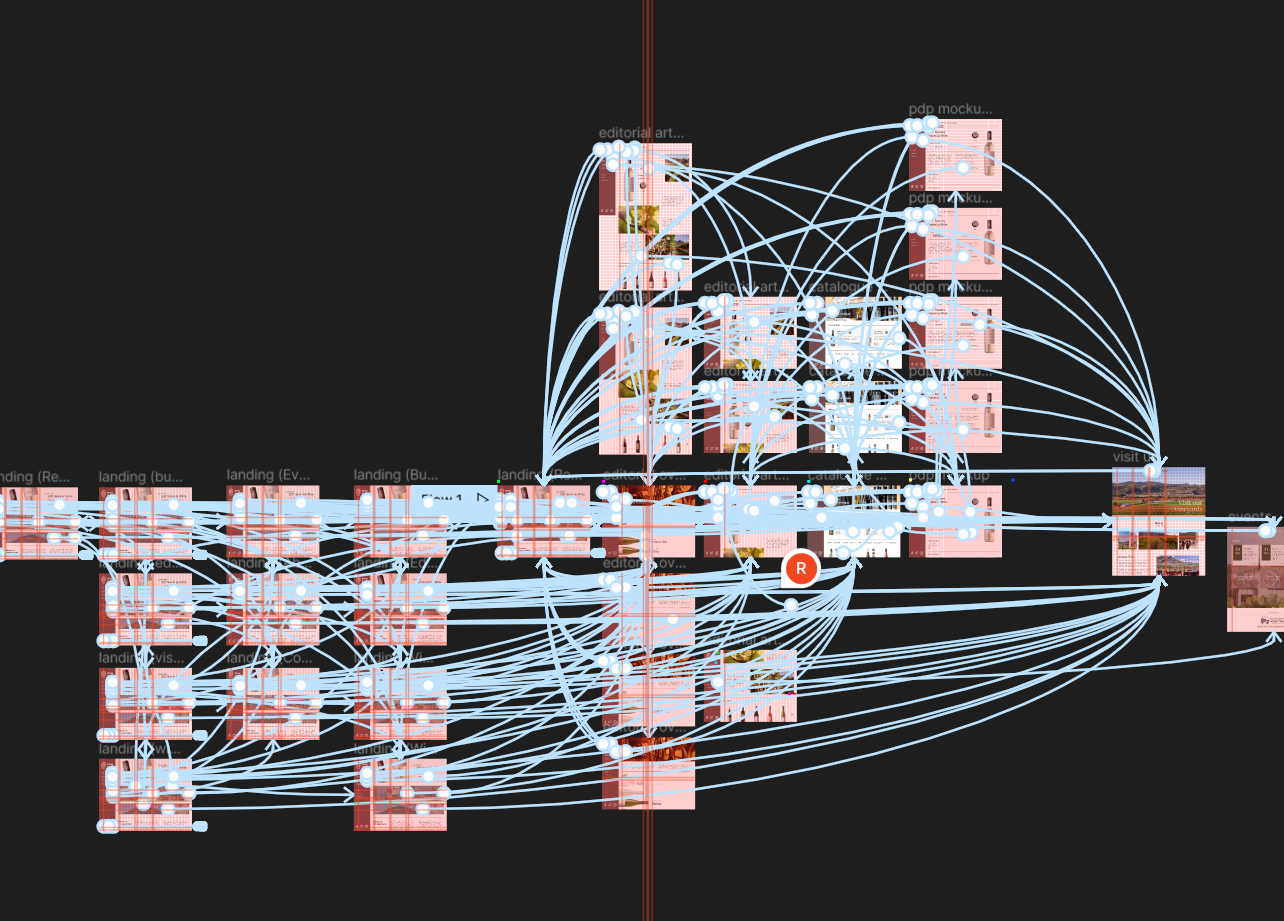
Figure 4: My conection of all the pages to one another via anchors in Figma.
Takeaways
One thing my group struggled with was the division of labour. Aside from my responsibility to connect the prototype, little was decidedly allocated to specific individuals. In the future I intend to more clearly allocate responsibilities from the beginning. Despite our impressive presentation, we took more than our allocated time. In future projects I hope to better plan presentations and showcases to adhere to the schedules of venues and audiences.
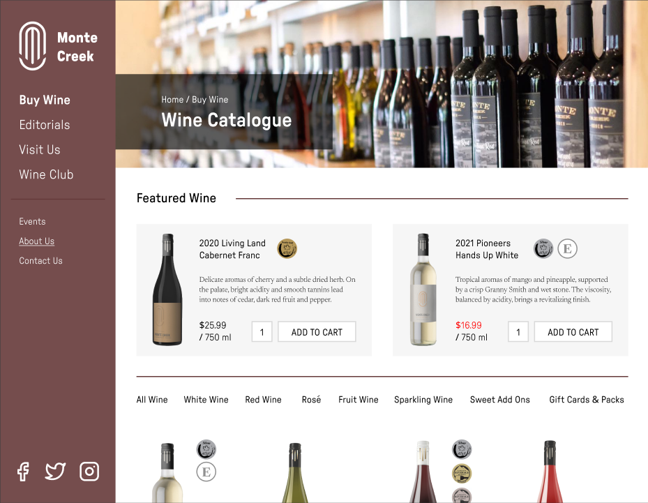
Figure 5: Another of our many high fidelity designs.